Interactive Visual Displays for Interpreting the Results of Clinical Trials: Formative Evaluation With Case Vignettes
- PMID: 29941416
- PMCID: PMC6037946
- DOI: 10.2196/10507
Interactive Visual Displays for Interpreting the Results of Clinical Trials: Formative Evaluation With Case Vignettes
Abstract
Background: At the point of care, evidence from randomized controlled trials (RCTs) is underutilized in helping clinicians meet their information needs.
Objective: To design interactive visual displays to help clinicians interpret and compare the results of relevant RCTs for the management of a specific patient, and to conduct a formative evaluation with physicians comparing interactive visual versus narrative displays.
Methods: We followed a user-centered and iterative design process succeeded by development of information display prototypes as a Web-based application. We then used a within-subjects design with 20 participants (8 attendings and 12 residents) to evaluate the usability and problem-solving impact of the information displays. We compared subjects' perceptions of the interactive visual displays versus narrative abstracts.
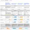
Results: The resulting interactive visual displays present RCT results side-by-side according to the Population, Intervention, Comparison, and Outcome (PICO) framework. Study participants completed 19 usability tasks in 3 to 11 seconds with a success rate of 78% to 100%. Participants favored the interactive visual displays over narrative abstracts according to perceived efficiency, effectiveness, effort, user experience and preference (all P values <.001).
Conclusions: When interpreting and applying RCT findings to case vignettes, physicians preferred interactive graphical and PICO-framework-based information displays that enable direct comparison of the results from multiple RCTs compared to the traditional narrative and study-centered format. Future studies should investigate the use of interactive visual displays to support clinical decision making in care settings and their effect on clinician and patient outcomes.
Keywords: clinical decision-making; clinician information needs; information display; information foraging theory; information seeking behavior.
©Jiantao Bian, Charlene Weir, Prasad Unni, Damian Borbolla, Thomas Reese, Yik-Ki Jacob Wan, Guilherme Del Fiol. Originally published in the Journal of Medical Internet Research (http://www.jmir.org), 25.06.2018.
Conflict of interest statement
Conflicts of Interest: None declared.
Figures


Similar articles
-
Physicians' perception of alternative displays of clinical research evidence for clinical decision support - A study with case vignettes.J Biomed Inform. 2017 Jul;71S:S53-S59. doi: 10.1016/j.jbi.2017.01.007. Epub 2017 Jan 13. J Biomed Inform. 2017. PMID: 28089913 Free PMC article.
-
Folic acid supplementation and malaria susceptibility and severity among people taking antifolate antimalarial drugs in endemic areas.Cochrane Database Syst Rev. 2022 Feb 1;2(2022):CD014217. doi: 10.1002/14651858.CD014217. Cochrane Database Syst Rev. 2022. PMID: 36321557 Free PMC article.
-
The future of Cochrane Neonatal.Early Hum Dev. 2020 Nov;150:105191. doi: 10.1016/j.earlhumdev.2020.105191. Epub 2020 Sep 12. Early Hum Dev. 2020. PMID: 33036834
-
Evaluations of physiological monitoring displays: a systematic review.J Clin Monit Comput. 2008 Feb;22(1):45-66. doi: 10.1007/s10877-007-9106-8. Epub 2007 Dec 7. J Clin Monit Comput. 2008. PMID: 18064532 Review.
-
Conceptual framework and systematic review of the effects of participants' and professionals' preferences in randomised controlled trials.Health Technol Assess. 2005 Sep;9(35):1-186, iii-iv. doi: 10.3310/hta9350. Health Technol Assess. 2005. PMID: 16153352 Review.
Cited by
-
Provider Preferences for Patient-Generated Health Data Displays in Pediatric Asthma: A Participatory Design Approach.Appl Clin Inform. 2021 May;12(3):664-674. doi: 10.1055/s-0041-1732424. Epub 2021 Jul 21. Appl Clin Inform. 2021. PMID: 34289505 Free PMC article.
References
-
- Leape L, Bates D, Cullen D, Cooper J, Demonaco H, Gallivan T, Hallisey R, Ives J, Laird N, Laffel G. Systems analysis of adverse drug events. ADE Prevention Study Group. JAMA. 1995 Jul 05;274(1):35–43. - PubMed
-
- Maviglia S, Yoon C, Bates D, Kuperman G. KnowledgeLink: impact of context-sensitive information retrieval on clinicians' information needs. J Am Med Inform Assoc. 2006;13(1):67–73. doi: 10.1197/jamia.M1861. http://europepmc.org/abstract/MED/16221942 M1861 - DOI - PMC - PubMed
-
- Ioannidis J. Why most published research findings are false. PLoS Med. 2005 Aug;2(8):e124. doi: 10.1371/journal.pmed.0020124. http://dx.plos.org/10.1371/journal.pmed.0020124 04-PLME-E-0321R2 - DOI - DOI - PMC - PubMed
-
- Cook D, Sorensen K, Hersh W, Berger R, Wilkinson J. Features of effective medical knowledge resources to support point of care learning: a focus group study. PLoS One. 2013;8(11):e80318. doi: 10.1371/journal.pone.0080318. http://dx.plos.org/10.1371/journal.pone.0080318 PONE-D-13-33090 - DOI - DOI - PMC - PubMed
Publication types
MeSH terms
Grants and funding
LinkOut - more resources
Full Text Sources
Other Literature Sources
Medical

